Introducing Lounges on Spotify
Providing a personable and seamless experience through in-app music sharing

Mobile first website
Type
1 month
Timeline
UXUI Design, UX Research, Wireframing, Prototyping, User Testing
Skills
OVERVIEW
What are Lounges?
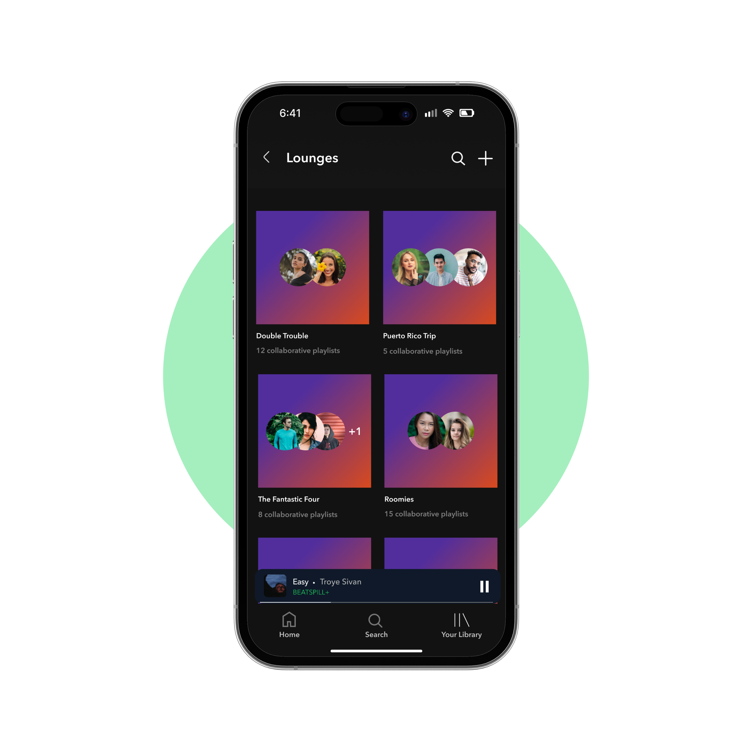
To encourage more social interaction between Spotify users, I developed features revolving around in-app music sharing. This is where users can invite friends to join "Lounges" where they can share music directly in the app, listen and react to songs together in real time, build collaborative playlists and edit playlist covers.

BACKGROUND
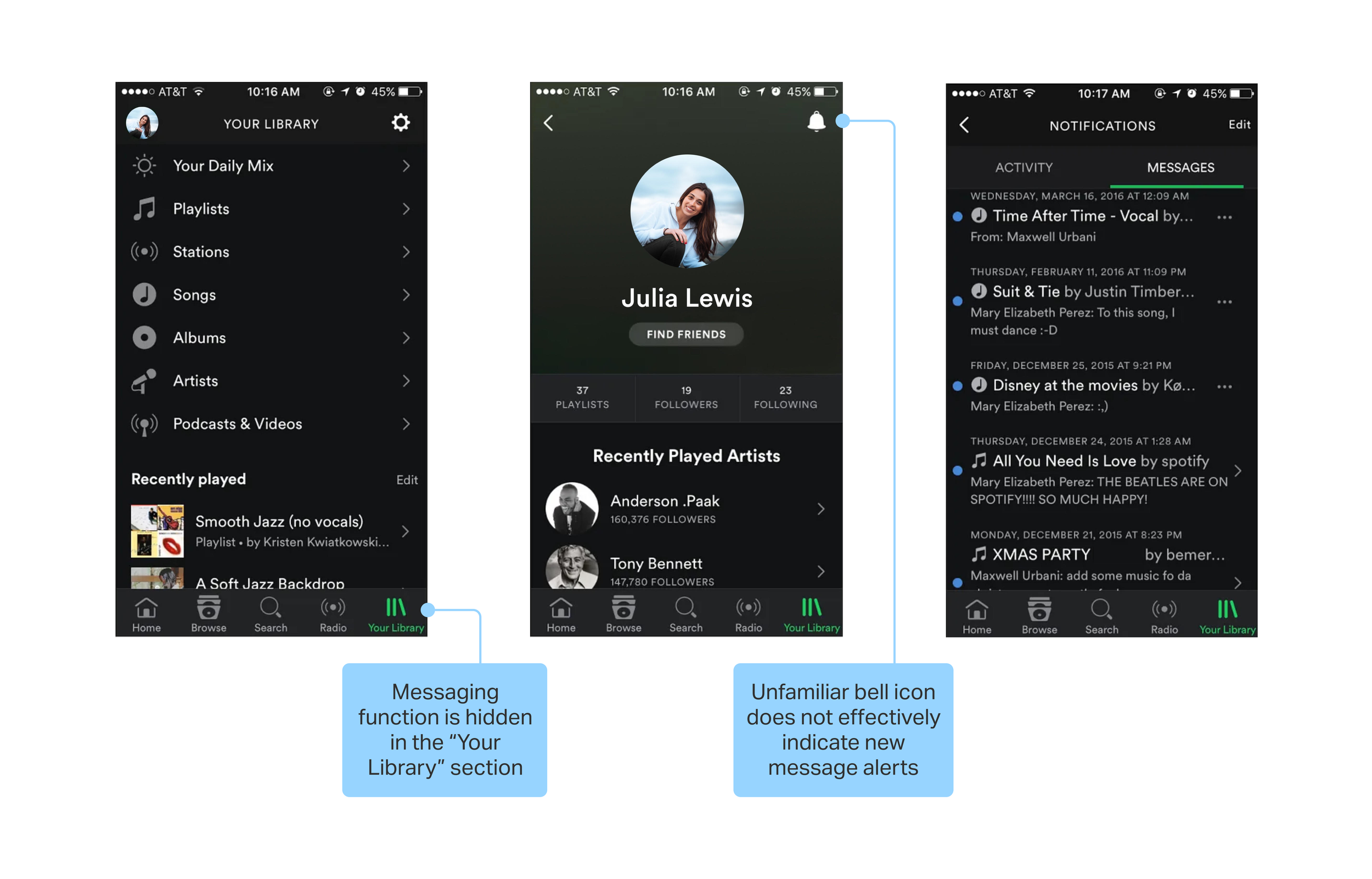
In 2017 Spotify removed the message feature due to low engagement
I believe this low engagement was due to the inbox feature’s lack of accessibility and effective user notification. People want to share music with friends and partners but the direct messaging on Spotify didn’t do well because:
Users didn’t know the messaging function existed, tucked away in the "Your Library" section under an unfamiliar bell icon.
Users neglected the feature due to its inconvenient placement and lack of prominent notifications. Without push alerts or clear indicators of new messages, engagement suffered.
THE PROBLEM
Absence of in-app sharing lends to lost opportunities to socially bond
Music is a universal language that is meant to be shared. However, majority of social media apps have in-app sharing in order to encourage social interaction and this is what Spotify lacks.
THE SOLUTION
Provide a personable and seamless experience that redefines the way people share music
Some of Spotify’s most popular features are personable: Spotify Wrapped, creating customizable playlists with friends, sharing music to your Instagram stories for friends to see. My goal is to push my proposed features in this same direction by creating in-app music sharing.
Keep all your shared music in one place
Discover new music with friends by inviting them to create a lounge
Seamlessly join and organize music-sharing groups with ease
Stay connected
Share music with friends directly in the app
Instantaneously add shared songs to collaborative playlists
Share your thoughts on your friend’s favorite music
Personalize your music sharing experience
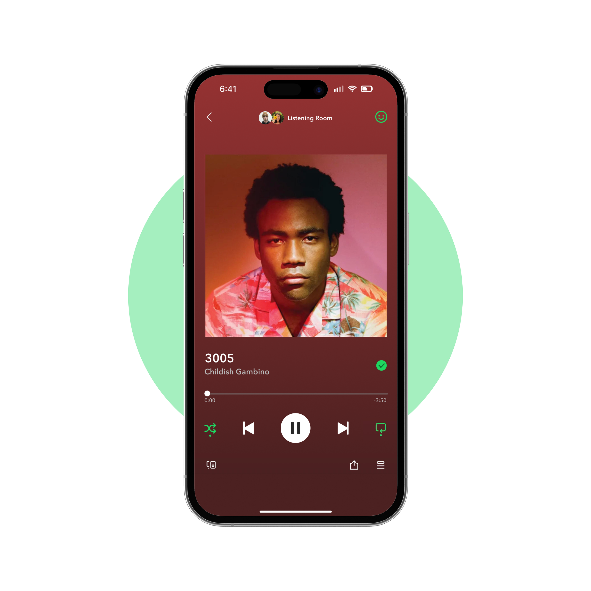
Listen and react to the music your friends are listening to in real time
Customize collaborative playlist covers with friends with frames, stickers, etc.
THE PROCESS
Let’s get a closer look
What path did I take to reach my solution? What were some design challenges I faced and how did I overcome them? What were my research findings and what did I learn?
HYPOTHESIS
Seamless music sharing will foster social interaction, boosting engagement
Spotify missed the mark in 2017 when it came to sharing music via messaging. Although Spotify missed this opportunity to make Spotify more sociable, I feel as though if these features were made to be more accessible and easier to navigate that it would have higher engagement.
WHITE PAPER RESEARCH
In-app messaging has shown to increase user retention
Before shifting into competitive analysis, I wanted to set the stage for my research by digging deeper.
In-app messaging boasts a 75% open rate, 3x higher than push notifications and 45x higher than email.
It was also found that inviting friends can encourage organic growth, lowering costs and increasing social engagement.
Source: Reckless AgencyCOMPETITIVE ANALYSIS
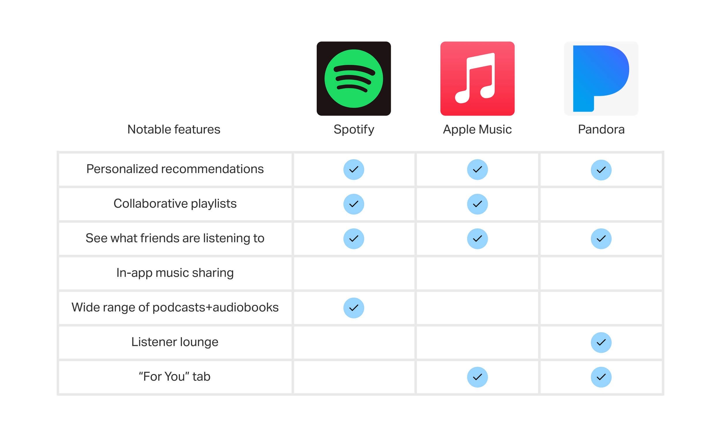
Lack of seamless music sharing seemed like an interesting avenue to explore
All platforms required users to share music via a link over iMessage or another social media platform. However, Pandora stood out when it came to social interaction with its Listener Lounge Forum where users can share their favorite music to a feed.

INTERVIEWS
Users highly valued efficiency and convenience when sharing music
Following my white paper research, I interviewed 5 users to explore their music sharing habits and motivations behind sharing content with friends. It was found that users not only prioritized efficiency and convenience when sharing music with one another but staying connected in general.


USER RESEARCH RECAP
After sifting through the feedback, the pain points began to surface
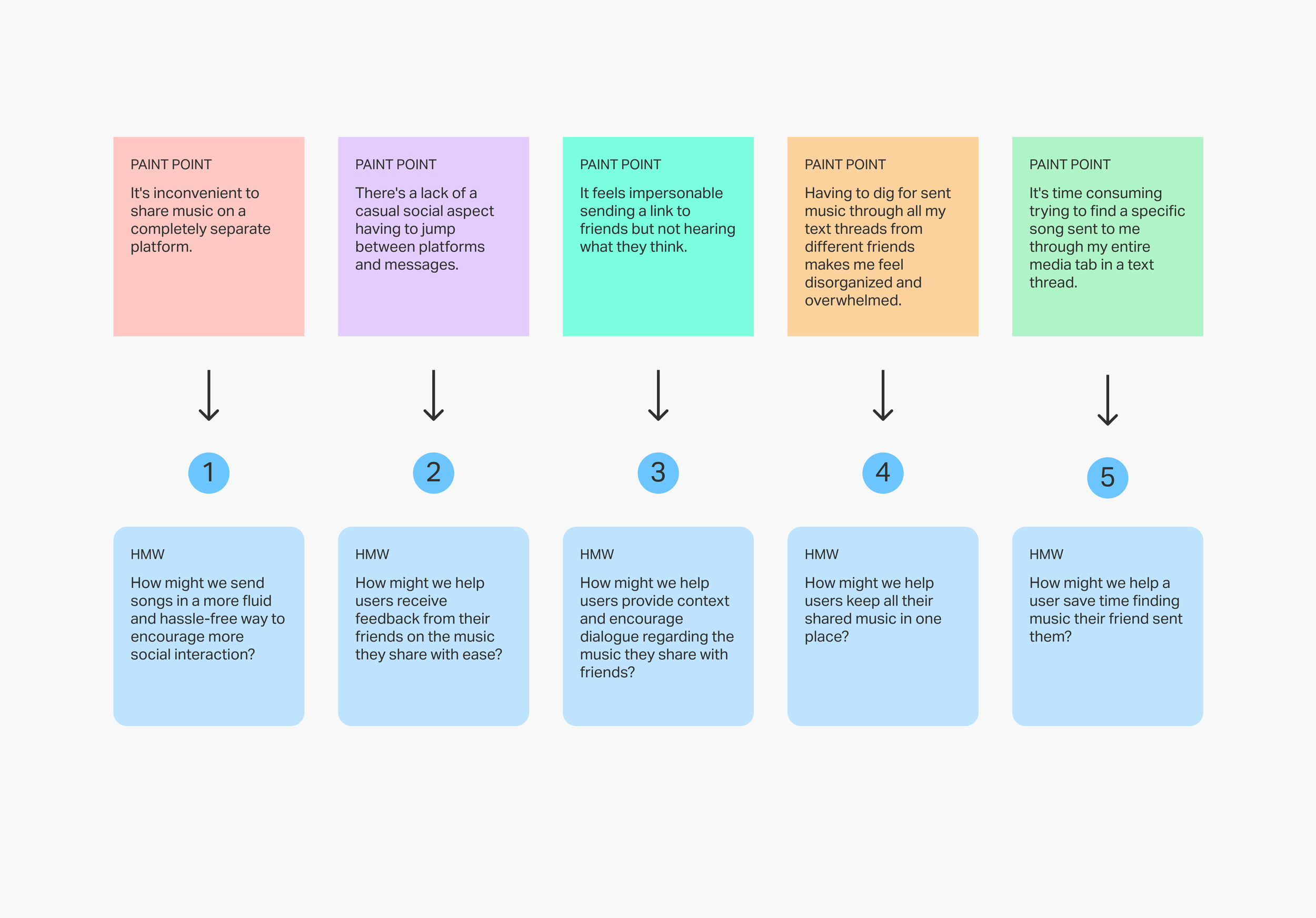
With the help of affinity mapping and user interviews, the most popular pain points when it came to music sharing began to surface:
lack of convenience
disorganized
lack of casual social aspect
impersonable
cumbersome

THE PERSONA
All users struggled with keeping track of the music their friends sent them
I applied all my user research to a persona to highlight commonalities. All users interviewed viewed music sharing as integral to social bonding and streamed music everyday. However, they also expressed that they feel disorganized when sifting through sent music.

POV AND HMW
How might we make music sharing more personable and seamless?
In order to provide a framework for my design, I defined 4 POV’s and 8 HMW’s. However, 5 HMW’s lead the way in creating the clearest roadmap for developing features that would make Spotify more social.


FEATURE SET
Features that made Spotify feel more social were put to the forefront
I shifted my focus to the features listed in “Must have” and “Nice to have” since they offered an experience that users felt like their music sharing experience was lacking. Since users view music sharing as a way to socially bond, I wanted to prioritize the features that encouraged social interaction which would in turn increase user retention.


TASK AND USER FLOWS
How will users navigate the new features?
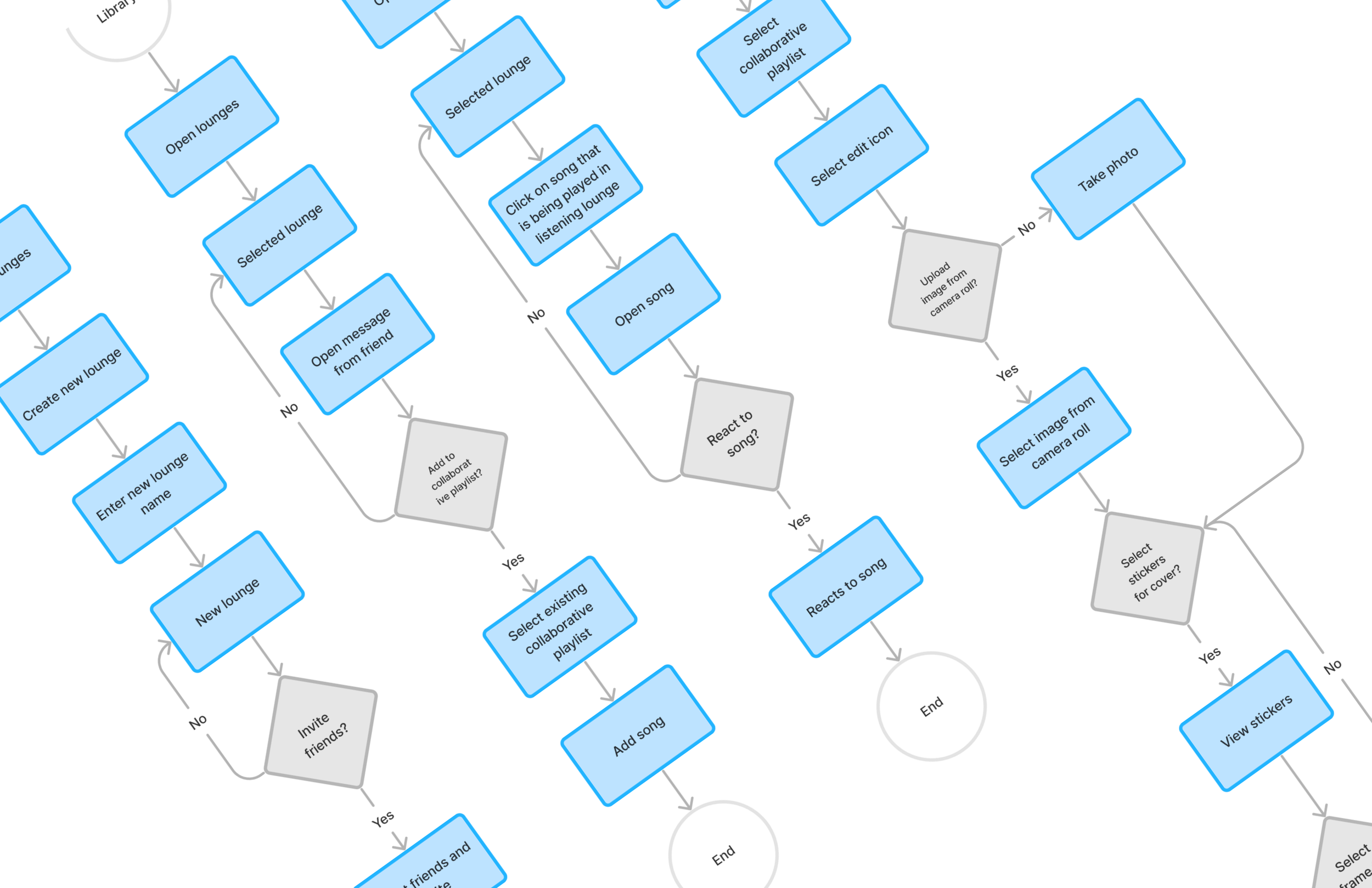
Before the design phase, I made sure there were no roadblocks in the user's navigation when using the new features by crafting 4 flows. My goal was to achieve seamless in-app sharing since this is what research showed users preferred.
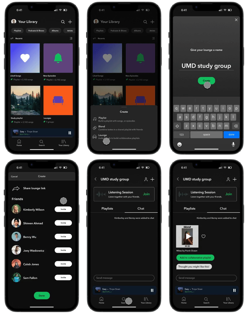
Create new lounge and invite friends
Adding sent song in chat to collaborative playlist
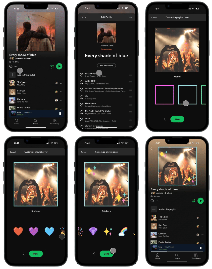
Edits album cover for collaborative playlist
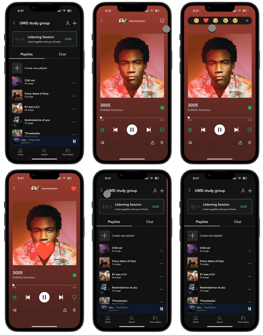
Viewing song in listening lounge and reacts

MID FIDELITY
I improved the hierarchy and seamlessness of the interface
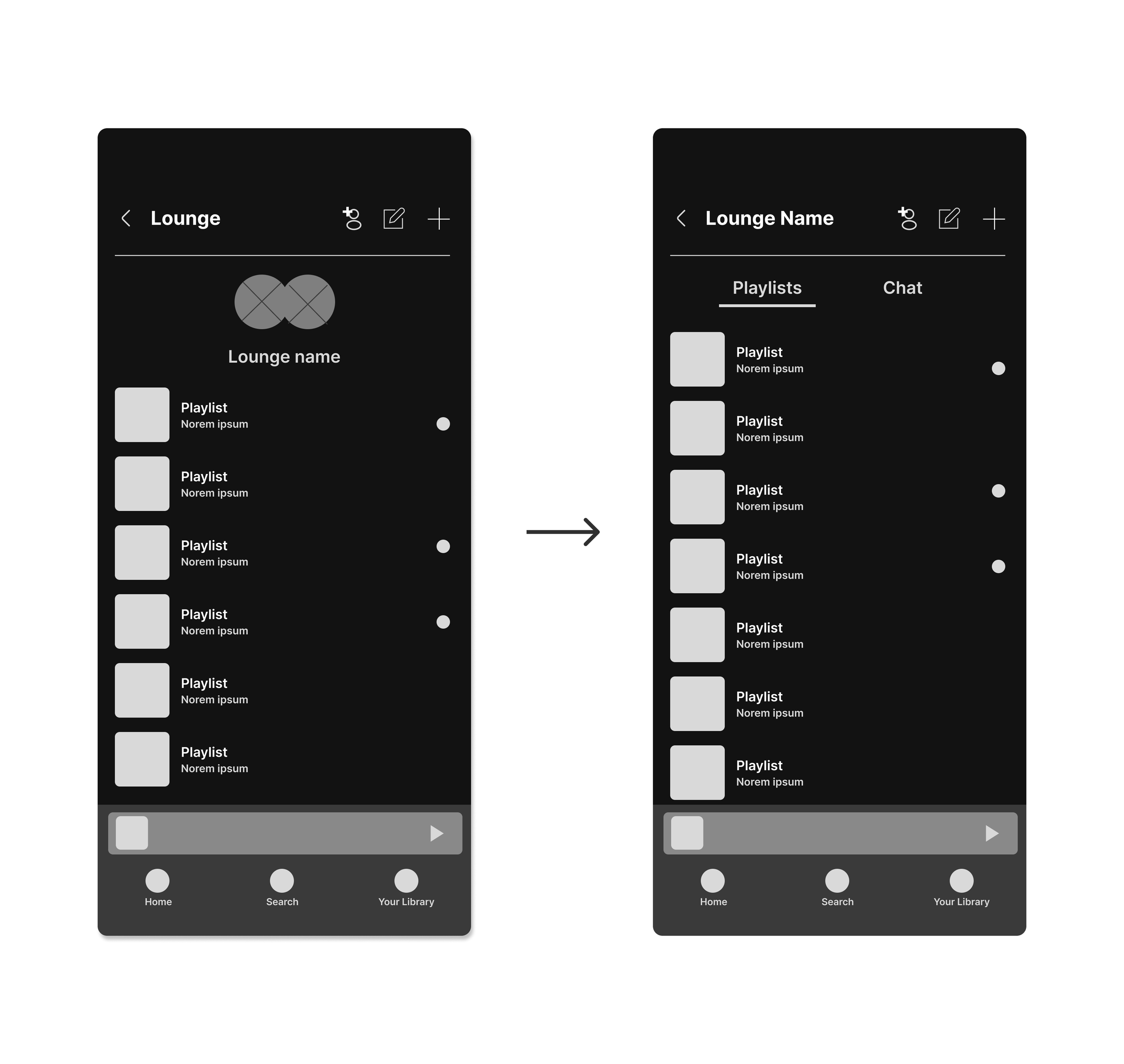
Based on these flows, I crafted mid-fidelity wireframes. Throughout this entire process I was consistently comparing my layout and design to Spotify’s existing UI. This stage also allowed me to get feedback from my mentor and group critiques before moving forward.
First round of iterations
Putting playlists and messages in the same hierarchy
Thanks to my mentor, I sorted out the hierarchy to help users better understand how these two parts of the interface relate to each other.
This, in turn, reduced the need for users to navigate between pages.
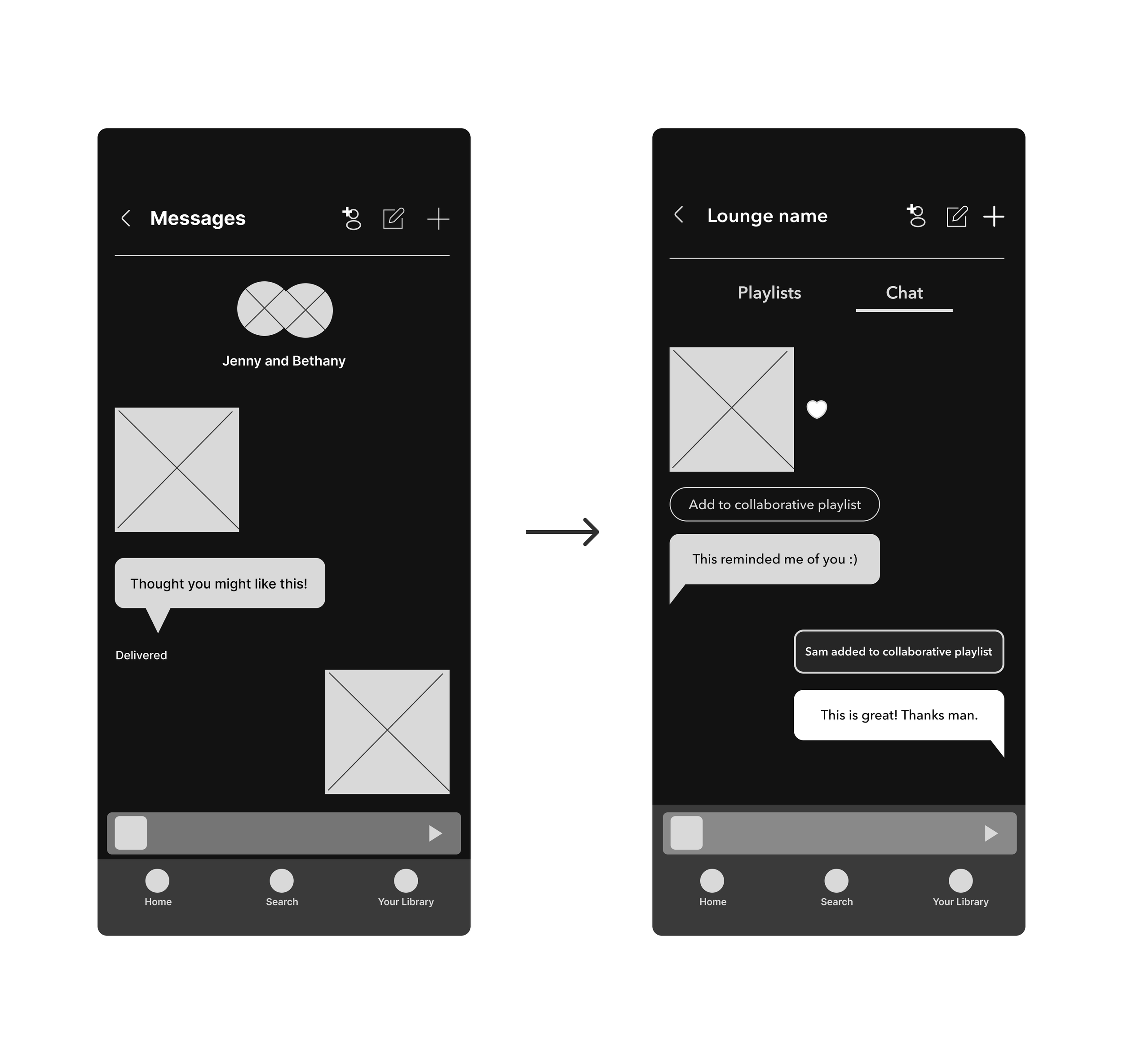
Second round of iterations
Making chat experience and collaborative playlist feel seamless
My mentor and peers suggested integrating these two features for user convenience.
With the principle of consistency in mind, I wanted it to resemble other apps utilizing in-app sharing.
Third round of iterations
Last but not least, now it was time to integrate the Listening Lounge
In the later stages of finalizing my layout, I wanted to merge the Listening Lounge with the chat.
By improving seamlessness I hoped to encourage more social interaction.
HIGH FIDELITY
Getting my design ready for detailed feedback
PROTOTYPE
Setting the stage to further iterate and tweak my interface
After improving my flows from the feedback I got on my mid-fidelity wireframes, I transitioned to my high-fidelity prototype to complete another round of user testing.
Create a new lounge and invite friends
Create new lounge to invite friends and share music
Build collaborative playlists together
Name each lounge with a unique name to personalize it
Add sent song to collaborative playlist
Add sent song from chat directly to collaborative playlist
Let friends know what you think of their sent song by like reacting or shooting them a message
Edit cover of collaborative playlist
Customize collaborative playlist cover with frames or stickers to make it feel more personable
All friends in the chat can personalize the collaborative playlist cover!
React to song being played in listening lounge
Enter listening lounge with friends to listen to a song together in real time
React to song with chosen emoticon to let your friend know you think!

USABILITY TESTING
Although there was a 100% completion rate, 2 areas of confusion stood out
I conducted in-person testing with 5 participants where I observed and took notes as they completed the flows. Throughout the entire process I asked them about any concerns or areas of confusion in regards to my flows.
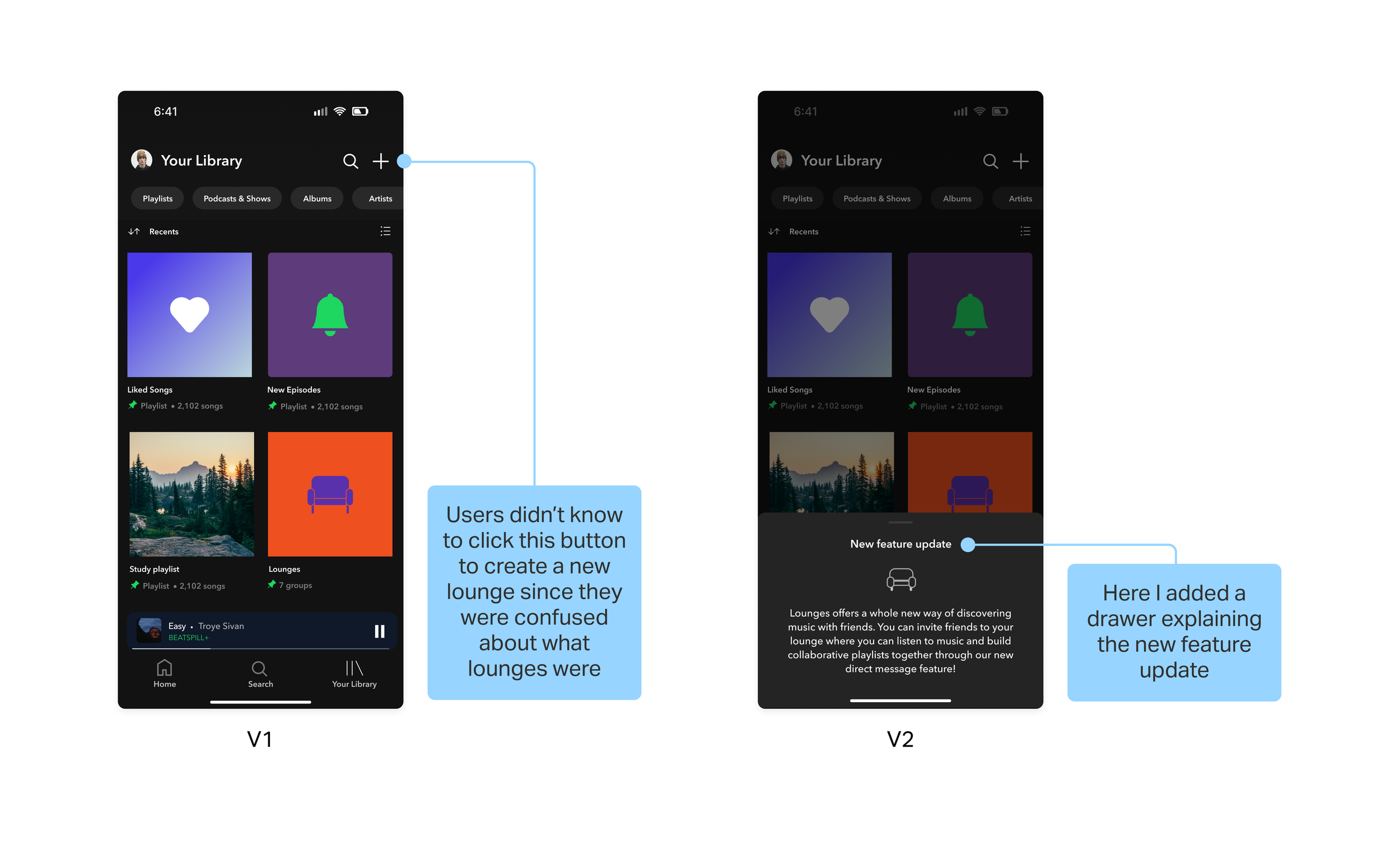
2 users misclicked when trying to create a new lounge and invite friends since they didn't fully understand what a Lounge was
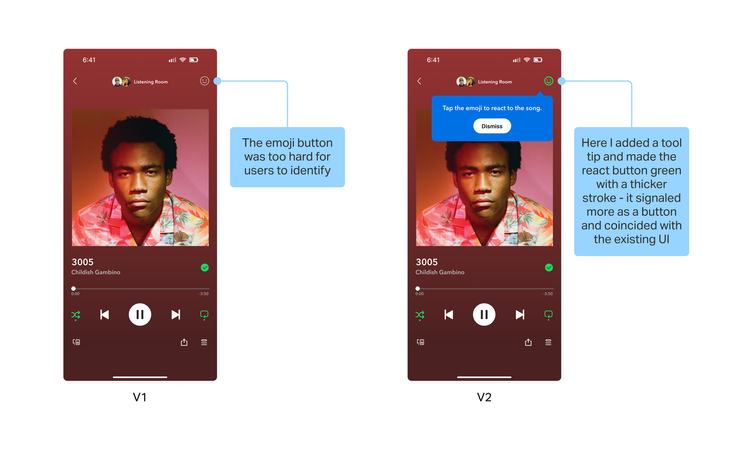
2 users misclicked when trying to react to a song being played in the listening lounge because the react button was hard to see
ITERATIONS
I enhanced user understanding and interaction with the new features
I made sure not to repeat the same mistake when it came to users understanding what the lounge concept is all about. I made an iteration where I added a drawer explaining the new feature to help them better understand it so that they can proceed with ease.
For my second and third iteration, I changed the color and stroke of the react button so it’s easier to spot and looks more like a button. Also, I added a tool tip to educate the user on how to use the new feature. I made sure to reference Spotify’s existing UI for tool tips.

REFLECTION
Unpacking what I learned
-
One of the most challenging aspects of this project was identifying a gap when it came to the users’ needs within an already established (and very successful) visual design system and filling in that gap. I only felt comfortable creating new features after dissecting the current design and identifying all its nuances.
-
During my research phase, specifically my white paper research, I prioritized learning as much as possible when it came to what social features Spotify is currently offering. I also tried to take into consideration the reasons as to which Spotify discontinued the direct message feature and to make sure to avoid the usability issues that they had come across prior and to use that as my guide. However, I ended up having to scrap majority of the ideas I had while brainstorming due to the fact that they lacked simplicity.
-
In the beginning stages, I ended up having to iterate my designs at least 5 times. I had to explore many different ideas in order to find the right solution for users. Having to make a lot of iterations isn’t necessarily a sign of failure, it just means I came across 5 potential solutions that didn’t work. From uncovering issues in my UI and more foundational problems with my UX, I’m grateful for the feedback I got from my peers and mentor.

