Palette Hub
As the art world goes digital, Palette Hub emerges as artists' ultimate companion in this transition

Desktop website
Type
1 month
Timeline
UX/UI Design, UX Research, Wireframing, Prototyping, User Testing
Skills
OVERVIEW
What is Palette Hub?
Palette Hub was created to aid artists in every step of their journey when transitioning into the digital art market. Our platform centers artists’ needs when it comes to enhancing discoverability, fostering effective communication with potential buyers, and making analytics and insights accessible which will in turn encourage artistic growth and success in the digital landscape.

THE PROBLEM
Transitioning into the digital art market with no guidance can be daunting
Artists have a knack for bringing their unique visions to life, but navigating the digital landscape to showcase and sell their creations can be intimidating. Modern artists are not only expected to be skilled at their craft and to continually develop their artistic skills, but to also…
Handle social media marketing
Communicate with buyers
Effectively self-promote
THE SOLUTION
Provide support and education resources to help artists find their target audience
Enhance discoverability
After checking analytics and insights, apply your top tags to applicable listings
Attract your target audience and potential buyers
Analyze your top works
Track revenue and orders for both prints and original works to analyze your top-performing pieces
Figure out which tags gain the most traction to learn how to stand out in the digital world
Unlock and elevate communication with buyers
Get your questions answered instantly with recommended advisory articles
Verify buyers’ legitimacy by reviewing their purchasing history and reviews
THE PROCESS
Let’s dig deeper
How did I arrive at my solution? What were my research findings? What obstacles did I encounter, and how did I overcome them?
HYPOTHESIS
Educating artists on how to navigate the digital shift will help them find their target audience
Before my interviews, I thought my user participants with an established online presence wouldn't need as much support finding their target audience. I was pleasantly surprised to discover common struggles in establishing a digital presence and finding a target audience amongst all interviews regardless of how established their online presence appeared to be.
WHITE PAPER RESEARCH
With the art world turning digital, finding your audience has become essential
Before jumping into my competitive analysis, I wanted to set myself up for success by diving deeper.
According to a 2023 survey, 25% of the art market’s total value was sold online.
It was also found that tags can boost engagement. For example, Instagram posts with at least one hashtag can see at least a 12.6% increase in engagement.
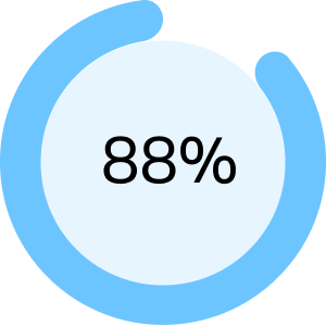
Source: LinkedIn and Moonlight Creative88% of marketers see an increase in sales when they use targeted marketing.
With more than half of said marketers reporting a sales boost of more than 10% after they tailor their marketing to their target audience.
Source: Constant ContactCOMPETITIVE ANALYSIS
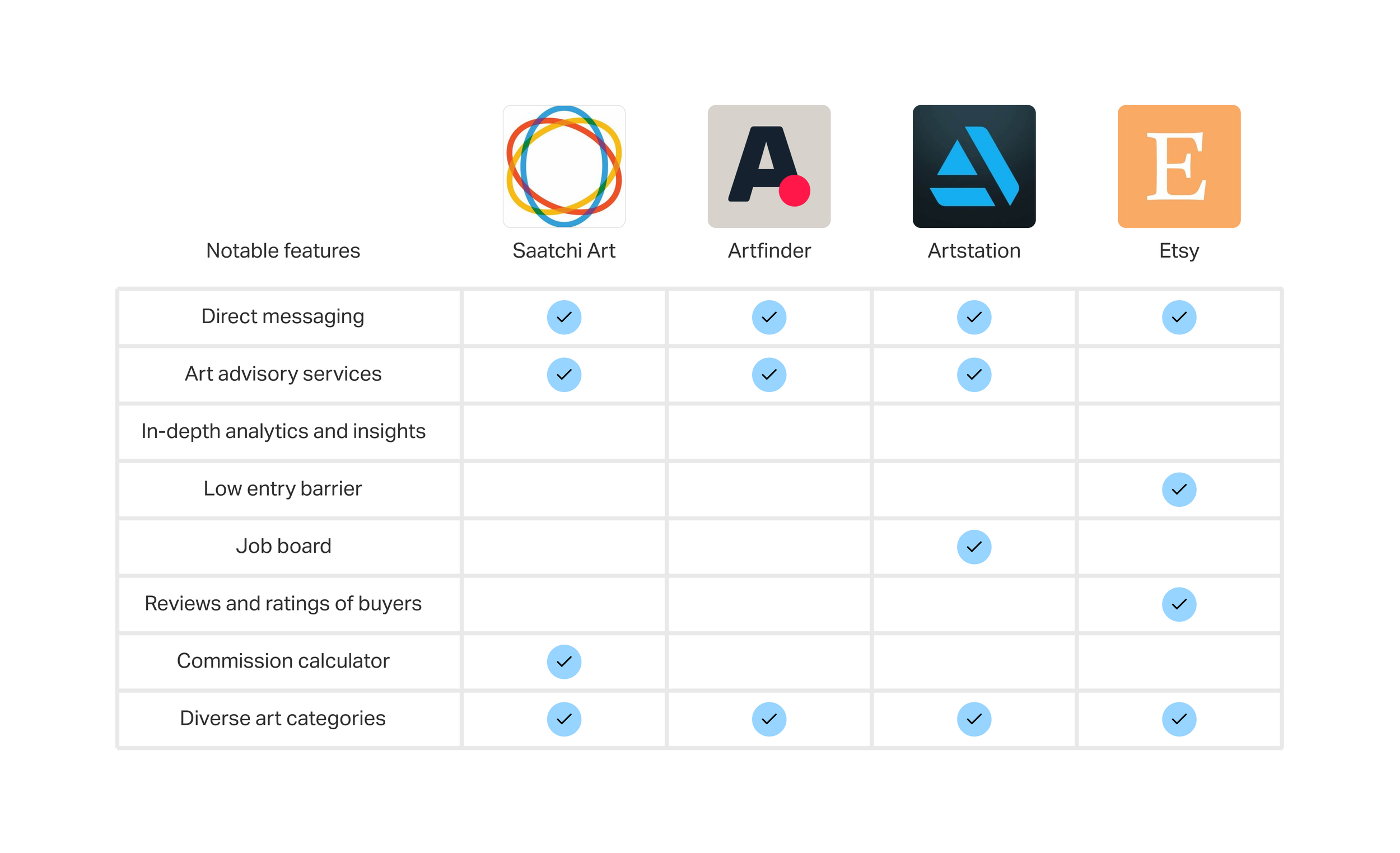
Lack of key insights provided amongst analytic reports presented as an opportunity to delve deeper
Most platforms reported sales and highlighted top-performing works, but they lacked specific insights highlighting why certain works outperformed others such as a predefined list of top tags which is essential for reaching a target audience. Also, only Etsy gave sellers the option to read reviews on buyers.

INTERVIEWS
Understanding artists' needs when making a name for themselves
I conducted virtual interviews with 4 participants to gain deeper insights into the methods artists adopt to sell their work online, particularly in regard to finding potential buyers and engaging their target audience.
1 user had 1 million followers on TikTok while another user had 19.8k followers on TikTok
2 users were artists who mostly sold locally since they didn’t have a large social media following
1 user was familiar with selling and purchasing artwork through auction houses


USER RESEARCH RECAP
I found 4 important user needs
After my interviews I had a plethora of responses and insights that I needed to organize. I turned to affinity mapping to help me better visualize and understand artists’ needs and pain points.
Target audience is essential for an artist's income.
Buyer communication feels disorganized from lack of necessary information.
Absence of support and mentorship.
Access to analytics is vital for optimizing marketing strategy.
PERSONAS
Artists faced business management challenges and wanted to stand out
Insights from user interviews and affinity mapping guided the creation of two personas. Although both user personas struggled with business management and sought guidance in navigating the online market and making a mark, there were some stark differences as well.
James, an artist with an established social media presence, sought help converting online engagement into sales.
Alexis, a local artist, faced challenges finding their target audience.

POV AND HMW
How might we help artists find buyers and effectively communicate with them?
To prepare myself for the design phase, I formulated 6 POVs and 14 HMWs. Among them, 4 HMWs emerged as the most hopeful.


FEATURE SET
I prioritized features that help artists convert online engagement into sales
I redirected my attention to “Must Have” and “Nice to Have” features since they offered the most promising solutions to the users’ main pain points.


TASK AND USER FLOWS
Creating a roadmap to help artists navigate their journey in finding buyers
The first flow is for reviewing shipping logistics via our art advisory services before engaging with potential buyers, addressing user pain points related to:
business management education
lessening disorganization when communicating with buyers
The second flow demonstrates checking analytics before posting an art listing, aiding users in finding their target audience by:
tag selection for optimal audience reach
converting engagement to sales

MID FIDELITY
Main dashboard refinement
Shifting my focus to my mid-fidelity screens helped me get a grasp of the overall structure and flow, especially when it came to the visual hierarchy and interface functionality. With the support of my mentor I implemented a side nav bar to help with:
Minimized information: trouble with space usage and unclear text size makes it harder to navigate
Space utilization: clear visual hierarchy and optimal space utilization

BRANDING AND UI KIT
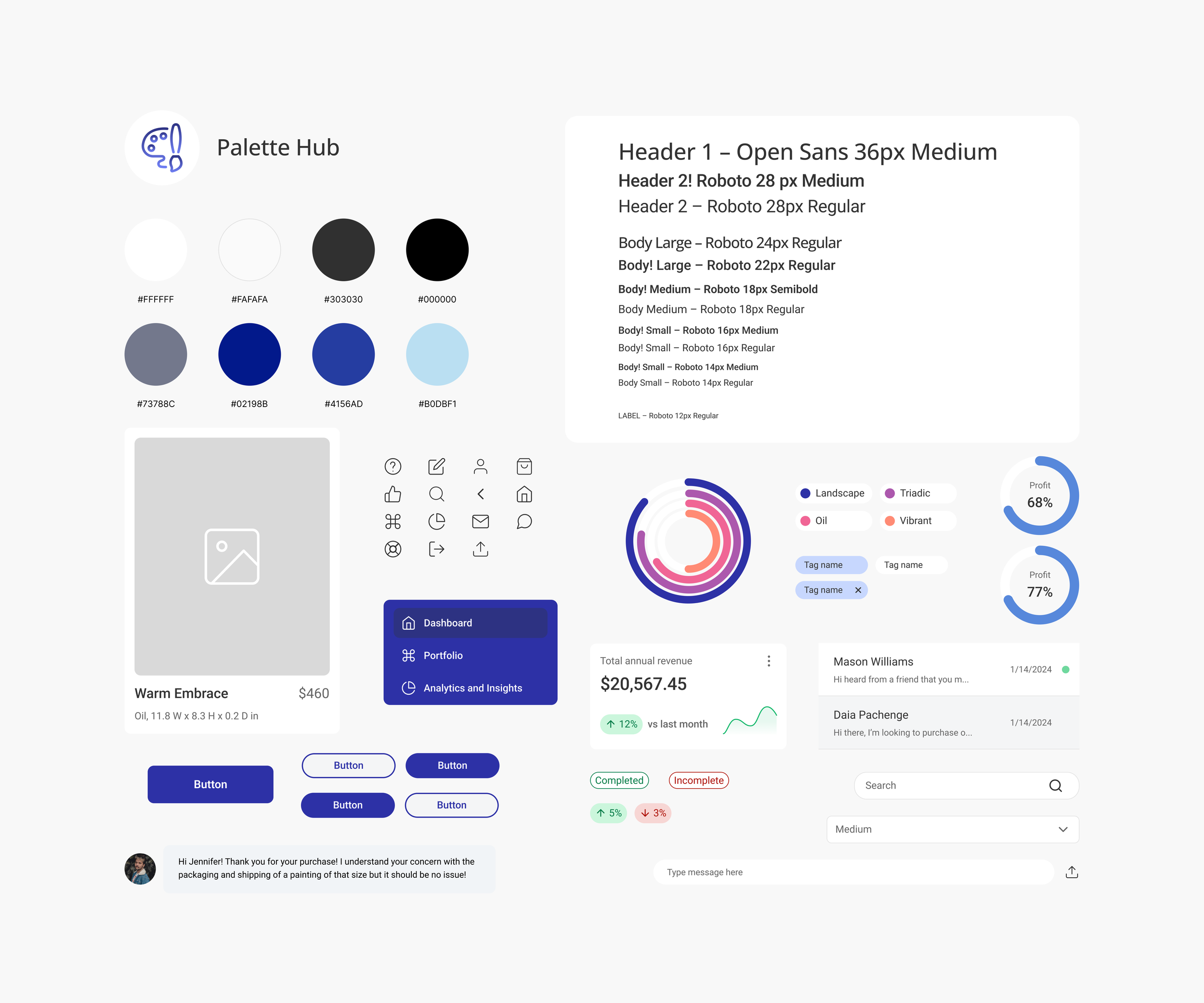
The artwork took center stage with a polished, modest design
To guarantee coherence across all screens, I created an organized UI kit to establish a robust framework for my design process. My goal was to have a sleek and professional layout like the high-art websites, but more accessible and less intimidating for new artists.

HIGH FIDELITY
Fine-tuned my design for an additional round of feedback
I was ready to move in high-fidelity once my mid-fidelity designs helped me finalize my interface layout, placement of elements, and visual hierarchy. At this stage it was my goal to do another round of iterations but this time with usability testing to tighten up any loose ends.
PROTOTYPE
Implementing my prototype to find room for improvement
Reviewing shipping logistics before responding to buyers
For this feature users can reference the recommended artist advisory article in chat to review shipping logistics, reassuring sellers of smooth sale completion before responding to inquiries.
Checking analytics and insights before posting new art listing
Here the user can check analytics and insights to see which tags are getting the most engagement in order to garner more sales. They then can post a new art listing with their top trending tags to attract their target audience.

USABILITY TESTING
Methodologies and results
I conducted in-person moderated testing with four participants, I observed their interactions with my prototypes and took notes as they completed the assigned tasks.

100% completion rate
In-person testing
2 areas of confusion
ITERATIONS
Users were confused with navigating between seller profiles and pages
For my first round of iterations after usability testing, I made adjustments in accordance with user expectations and I streamlined flow completion time by enhancing interface clarity.
I put the “learn more about buyer” button under the profile picture to align with user expectations, since they assumed the profile picture was clickable.
I integrated 4 direct shipping advisory buttons to streamline navigation and reduce page switching.
Users said they felt disoriented being taken to an entirely different page. So I made one last iteration.
I created a modal that pulls up the art advisory steps when they select the desired article within the message thread.
Users never have to leave the message tab, enhancing seamlessness and saving time when seeking answers.

REFLECTION
Unraveling key takeaways
-
In previous projects, my user interviews mostly featured participants with similar pain points and backgrounds. This project, however, pushed me to design features catering to a wide range of artists at various stages of their art journey. This included considerations for digital market presence and online branding, accommodating both established artists with large followings and local artists striving to build their reputation. Despite their differences, I found common pain points and solutions applicable to all users, expanding my empathy and revealing universal user group similarities. This experience emphasized the importance of understanding diverse user needs, behaviors, and preferences.
-
During this design process aimed at teaching artists self-promotion and standing out in a vast digital market, I learned the critical importance of simplicity and clarity. Artists responded positively to clear, step-by-step guides and graphs that demystified attracting your target audience and effectively communicating with them. Emphasizing key strategies like focusing on engaging content that centers their target audience’s interests helped artists grasp the essentials of finding potential buyers. Iterative improvements based on user feedback reinforced the significance of user-centered design in facilitating artists' journey to successful self-promotion.


